Body Shop Graphics for MCC
|
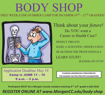
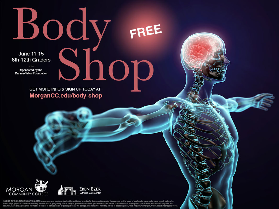
The original ad for the Body Shop at MCC was problematic. It was being used to advertise the camp to 8th-12th graders interested in the health sciences. The problem was that the original ad did not give off the collegiate look to it. It did look like it was designed for younger audiences, but too young for this camp, and it was pixelated. The character in that ad looked confused. The rest of the information was chaotic with too many fonts, information spread out to different areas, and didn't represent MCC as a place of higher learning.
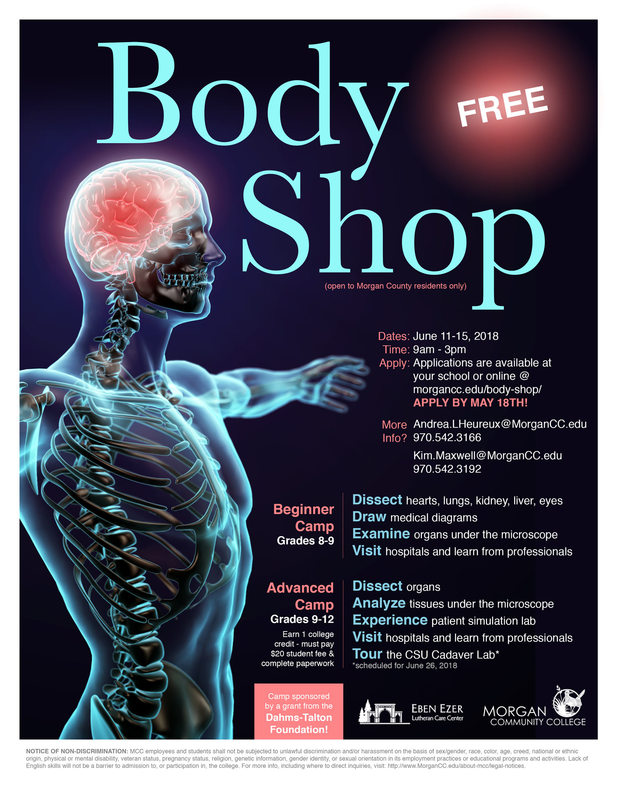
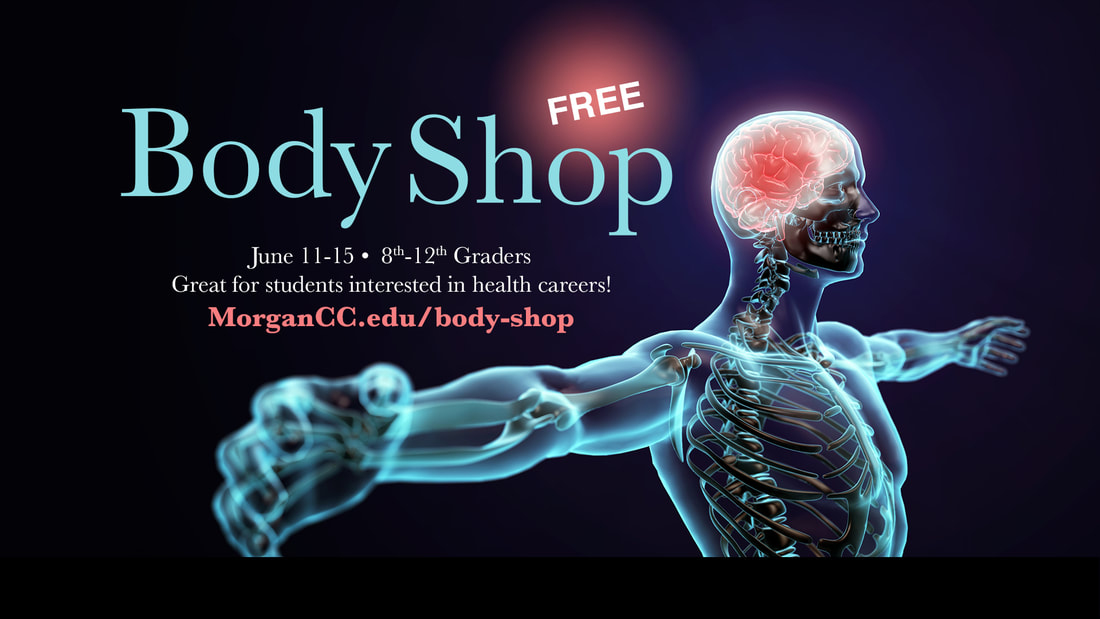
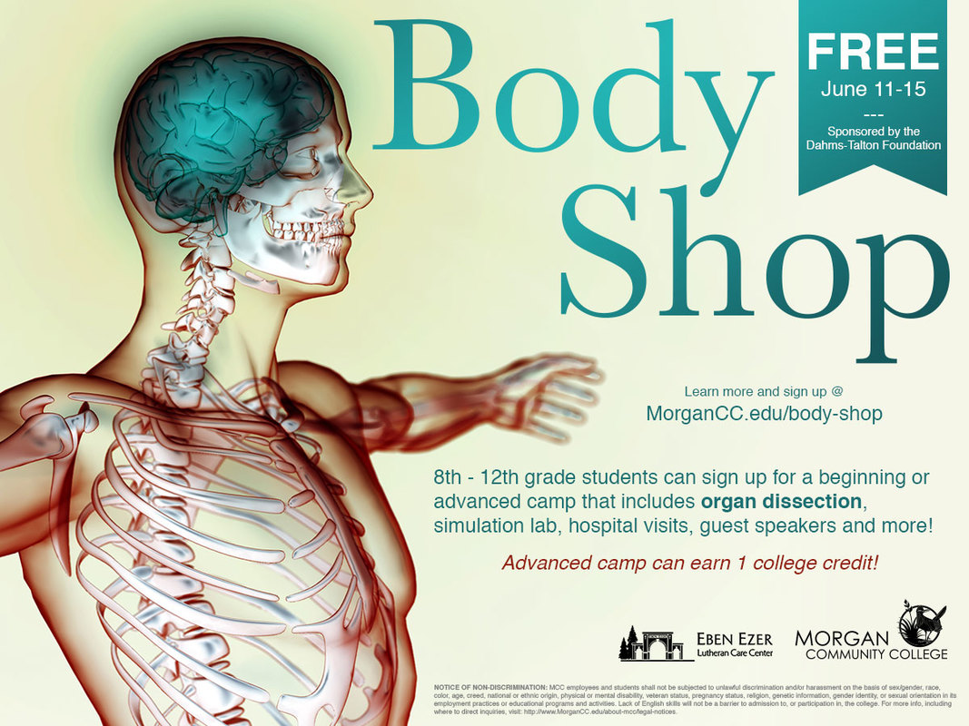
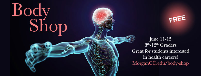
To fix this, I found one big hero image that was bold and eye-catching enough to grab our attention first and then get us to read the information. Subtle branding to show who was involved with the camp, color sampled directly from the photo, re-organization of the information, and simplified text to entice...and in the end we had a strong graphic for the camp. Social media posts with some visual variety would keep the camp at the top of people's minds so they would eventually sign up. |
Software used:
Adobe Photoshop CC 2018 Adobe Illustrator CC 2018 |
